Brand
Brand guidelines.
The system behind Cronite Cast Limited: one monogram, one wordmark, a metal-derived palette and a small set of components. The rules exist so the identity stays consistent across print, packaging and screen.
Tokens in this document are the same values the site builds from. Colour values are verified against src/app/globals.css by npm run brand:contrast.
Logo
Four lock-ups, one mark.
The mark is drawn as outlines at build time, so it renders identically everywhere and inherits the colour of its container.
Horizontal
Default. Header, letterhead, quotation cover, wide formats.
Stacked
Square and portrait formats: packaging, footer, social avatars.
Monogram
Favicons, seals, small marks where the wordmark would be illegible.
Compact
Tight horizontal spaces where vertical height is constrained.
Rules
- Clear space: at least half the cap height of the wordmark on every side. Nothing enters that area.
- Minimum width: 120 px for the horizontal lock-up, 48 px for the stacked lock-up, 24 px for the monogram.
- Colour: obsidian or black on light grounds; ivory, white or champagne on dark grounds. No other colours.
- Never stretch, condense, rotate, outline, add shadows or apply gradients.
- Never set the wordmark in type: always use the outlined logo files, which do not depend on an installed font.
Colour
A palette drawn from the metal.
Eight values. Two accents, and they are not interchangeable: champagne is a dark-ground accent, bronze is a light-ground accent. Every pairing the site uses is verified by npm run brand:contrast.
Obsidian
#111315 · --color-obsidian
Primary dark surface; primary text on light surfaces.
Never pure black. Carries body copy on ivory and grounds editorial panels.
Obsidian Raised
#191c1f · --color-obsidian-raised
Raised panels on a dark surface.
One step lighter than obsidian so nested panels read without a border.
Ivory
#f6f3ec · --color-ivory
Primary light surface.
Warm off-white. The default page background and the ground for most text.
Champagne
#c6a66a · --color-champagne
Accent on dark surfaces; primary button ground.
Reaches 8:1 against obsidian but only ~2:1 against ivory. Text, icons and borders on light surfaces use bronze, never champagne.
Bronze
#80622f · --color-bronze
Accent text, eyebrows and focus rings on light surfaces.
The dark-surface accent and the light-surface accent come from the same metal family but are not interchangeable.
Slate
#545a60 · --color-slate
Secondary and supporting text.
Only used for text that must still clear 4.5:1 on ivory and the input surface.
Stone
#e5ded2 · --color-stone
Dividers, rules and tinted panels.
Decorative only. Stone does not carry information, so it is never used as an interactive border.
Line Strong
#8a8579 · --color-line-strong
Borders that carry information.
Clears 3:1 against ivory and the input surface, which is why form fields use it rather than stone.
Contrast thresholds
- Body text below 24 px: 4.5:1 (WCAG 1.4.3 AA).
- Text at 24 px or 18.66 px bold and above: 3:1.
- Borders, focus rings and icons that carry meaning: 3:1 (1.4.11).
- Dividers and hairlines that carry no meaning: exempt, but still checked.
Opacity
Translucent text is treated as a real colour: ivory at 60% over obsidian is measured as the composited value, not as ivory. Nothing below 55% opacity is used for text.
Typography
One serif for presence, one sans for precision.
Display · Cormorant Garamond 300–700
Weight and fineness
ABCDEFGHIJKLM · 0123456789 · £ — · ’ “ ”
Headings only. Set at 300–400 weight, tight tracking, never below 1.3 rem. Italic is reserved for the unconfirmed-value fallback.
Sans · Manrope 200–800
Precise by default
ABCDEFGHIJKLM · 0123456789 · £ — · ’ “ ”
Body copy, labels, buttons and numerals. Tabular figures for anything numeric. Labels are uppercase with 0.1–0.2em tracking; body copy is never letterspaced.
| Style | Token | Size | Use |
|---|---|---|---|
| Hero | --text-hero | clamp(2.5rem–4.9rem) · line-height 1.04 | Home page statement only. |
| Heading 1 | --text-h1 | clamp(2.15rem–3.6rem) · line-height 1.08 | One per page, in the page header. |
| Heading 2 | --text-h2 | clamp(1.8rem–2.65rem) · line-height 1.12 | Section headings. |
| Heading 3 | --text-h3 | clamp(1.3rem–1.65rem) · line-height 1.22 | Card and sub-section headings. |
| Lead | --text-lead | clamp(1.0625rem–1.25rem) · line-height 1.65 | Opening paragraph under a heading. |
| Label | --text-label | 0.6875rem · uppercase · 0.2em tracking | Eyebrows and small structural labels. |
Spacing & layout
Measured in rhythm, not ad-hoc gaps.
Two spacing tokens carry the whole site: one for gutters, one for vertical section rhythm, with a tighter variant for compressed sections. Nothing is spaced by eye.
--spacing-gutter
clamp(1.25rem, 5vw, 4.5rem)
Page gutters.
--spacing-section
clamp(4rem, 8.5vw, 8rem)
Standard section rhythm.
--spacing-section-tight
clamp(2.75rem, 5vw, 5rem)
Compressed sections and page closes.
--radius-xs
2px
Buttons, panels, inputs.
--radius-sm
3px
Reserved for larger surfaces.
- Layout grid: 12 columns on large screens, collapsing to a single column below 640 px.
- Container: 90 rem maximum width, with fluid gutters.
- Measure: body copy is held between 46 and 62 characters per line.
- Radii: 2 px. Nothing is pill-shaped; the brand is square-edged.
- Rules: 1 px stone on light surfaces, 1 px champagne at 26% on dark surfaces.
Imagery
Studio renders, never borrowed stock.
Product imagery uses a controlled studio style: warm neutral light, a single source, matte surfaces, no reflections of people or other brands. Each image is labelled as a rendering rather than a photograph of metal held.
- No photographs of stock the business does not hold.
- No refiner logos, serial numbers, assay certificates or hallmarks are depicted.
- No people, hands or jewellery in product imagery.
- Backgrounds stay within stone, ivory and obsidian — no pure white or pure black.
Source files live in public/media as WebP: hero ingots, a single kilogram ingot, small bars, grain, sheet, a studio still life and a gold texture.
Interface
Components and their rules.
Buttons
Minimum height 48 px, 2 px radius, uppercase at 0.14em. One gold button per view: it marks the single most important action.
Buttons on dark
The outline variant uses champagne at 55% for its border — the lightest border allowed on obsidian.
Tags
Tags carry status words only. They are never buttons and never introduce a colour that is not already in the palette.
Form fields
Fields use a 3:1 informational border, a 48 px target height and a visible error state. The live form, including validation styling, is on the enquiry page.
Accessibility
Built to a threshold, not a look.
- Every text and interface colour pairing is measured; the audit fails the build gate if one drops below its threshold.
- Keyboard focus is always visible: a 2 px bronze ring on light surfaces, champagne on dark.
- Motion is progressive enhancement only. Content is fully visible without JavaScript and with reduced motion enabled.
- Form errors are linked to their field with aria-describedby and summarised at the top of the form.
- Interactive targets are at least 44 px in their smallest dimension.
Packaging & stationery
Concept onlyEditable concepts, not print files.
Six deliverables are drafted as editable SVG: a presentation box sleeve, a product information card, business cards, letterhead, a quotation cover and discreet shipping packaging. They apply the identity at plausible dimensions.
- Presentation box sleeveSleeve dieline, flatOpen SVG
- Product information card85 × 55 mm, both sidesOpen SVG
- Business cards85 × 55 mm, both sidesOpen SVG
- LetterheadA4, first pageOpen SVG
- Quotation coverA4 coverOpen SVG
- Shipping packagingOuter carton and labelOpen SVG
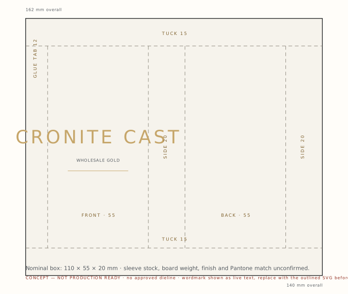
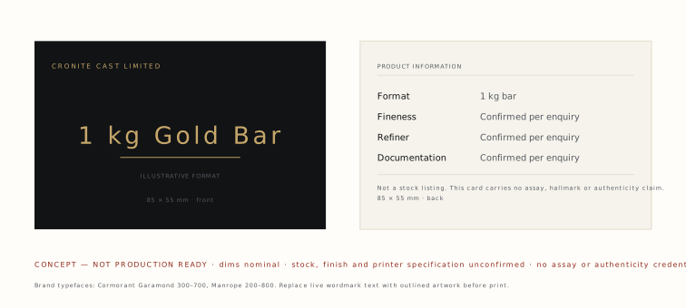
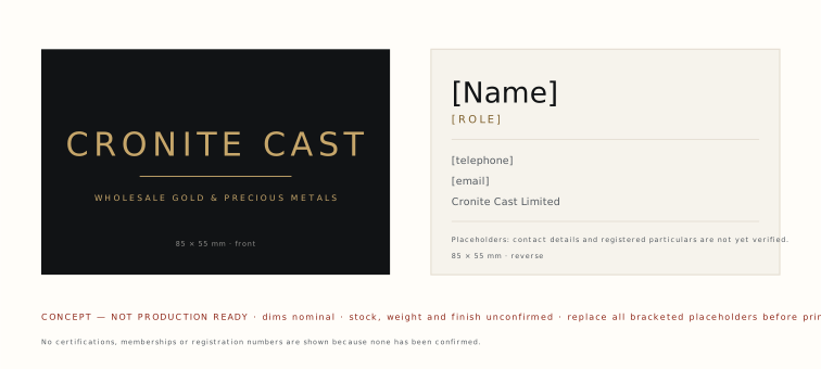
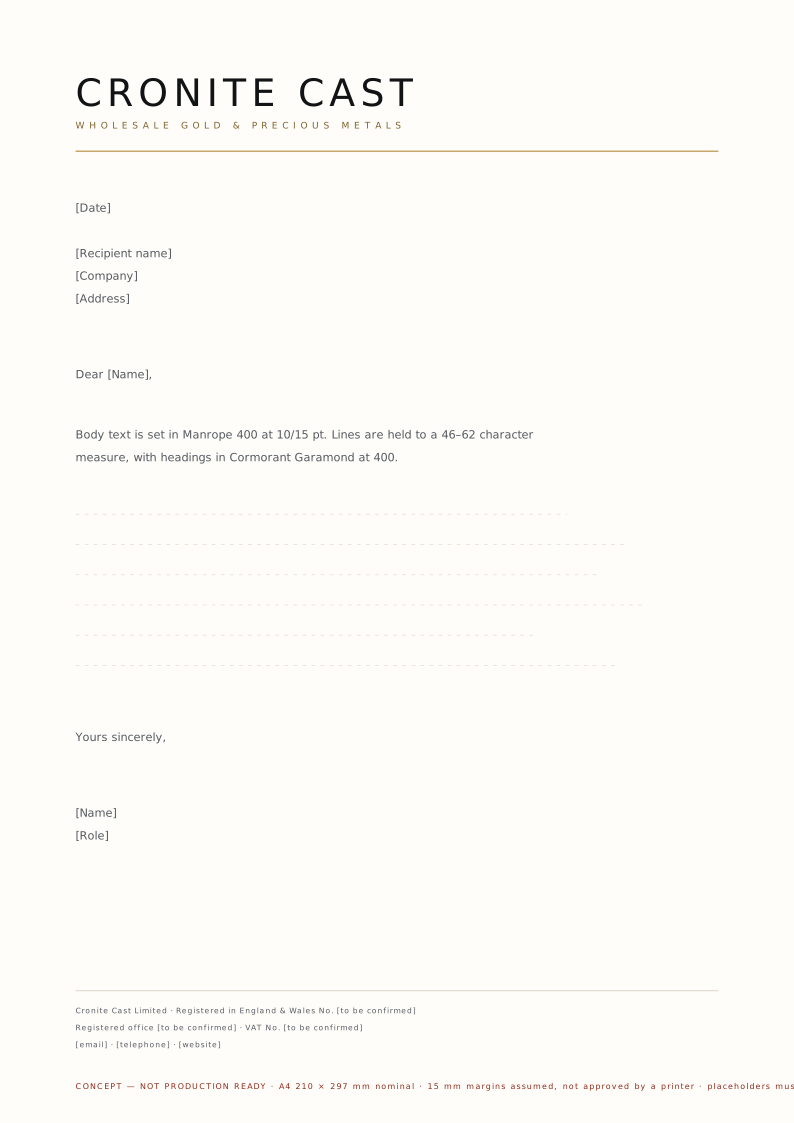
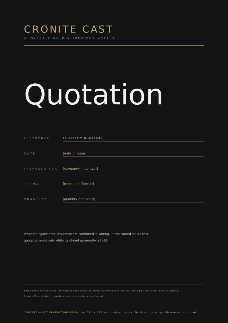
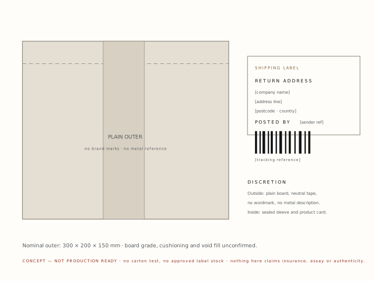
Not production-ready. Dimensions are nominal, no dieline has been approved by a converter, and stock, weight, finish, Pantone matching and foil specifications are unconfirmed. Concepts carry no assay, hallmark or authenticity claims.
Downloads
Logo files.
SVG files are outlined and self-contained. Raster exports for contexts that cannot use SVG are in /brand/png.









Applying the system.
The written guide covers the same ground for designers and printers, including the rules this page implements.